Characteristics of effective logo design

In order to get noticed and stay in the mind of consumers, every company needs an eye-catching, effective logo that can represent the image, activity and purpose of the enterprise. Consider the all pervasive, famous logos like those of McDonalds, Coca Cola, Facebook, Apple etc. which are instantly recognizable and identifiable in an overly crowded advertising world.


Nowadays, the Internet is full of freelance graphic designers and companies offering logo creation services at very affordable prices. But in this excess of quantity, is quality still on the mind of graphic designers?
In order to have a strong brand and a powerful complement to one’s Internet presence, a quality logo is absolutely necessary. Below are the main characteristics of effective logo design:

1.       Simplicity

The most recognizable logos in the world all share a common feature: they are simple, streamlined and easy to represent quickly. In a world that is overloaded with brands, having a complex, intricate logo is equivalent to getting lost in a sea of information. Superfluous details in logo creation must be avoided at all costs and eliminated. The main concept must be crystallized in a clean, neat manner, so that the resulting logo can be easily remembered by the target audience.

2.       Versatility

An effective logo looks fantastic in a wide range of advertising media. Whether it will be printed on a brochure, business card, company letterhead or displayed on an animated billboard or web banner, a good logo should look great in every situation. The logo also must be easily scalable and customizable for a large variety of purposes. Furthermore, the logo should also be adaptable and acceptable to a wide range of cultures. In a globalized world, it is important to have a brand image that is internationally appreciated.

3.       Distinctiveness

An effective logo is unique and stands out from the crowd. While it may seem tempting to take inspiration from others’ logo designs or pay tribute to an idea you admire, it’s best to think outside the box and come up with something original and innovative as your logo. Many businesses in the same area of activity have similar-looking logos, which means that the target customer may find it hard to differentiate them.

4.       Suitable to the business

Naturally, a good, effective logo suits the business, both in terms of image and field of activity. For example, if the business is a toy manufacturer or a party planning business, it is appropriate to suggest an idea of playfulness by using multiple colors and cute graphic elements like flowers and bows. However, if the company deals with producing factory machinery or cars, then it is more suitable to make a logo that reflects seriousness and a more somber vibe.

5.       Appealing to the target audience

An effective logo captures the attention of the customer demographic that the business caters to. If the company caters to a very exclusive group and sells high end, luxury products, it is best to have a logo that oozes sophistication and class. On the other hand, if the business aims to appeal to low-income families on a budget, a logo that signals accessibility and simplicity would be a more appropriate choice. It’s all in attracting the customer and enticing him to find out more about your brand.


It’s not easy to create a good logo that fulfills all the characteristics above, but if the balance between form and content is found, the branding process becomes more effective and well-targeted. It’s difficult to know what makes a fantastic logo: often, a famous logo seems like the result of a stroke of genius or a mere fluke.

7 graphic design books you should read

Written by industry experts and well-known Photoshop gurus, graphic design books are an overwhelming source of information and inspiration. They contain valuable tips and tricks, techniques and ideas that are very useful for any graphic designer regardless of their skill level.

By reading one or several of the books below and applying the theoretical or practical advice they contain, you can become more creative, improve your workflow, upgrade your overall skill as a graphic designer, and dramatically increase the quality of your work.


1.       ‘Photoshop CS5: The Missing Manual’ by Lesa Snider is a comprehensive guide for all the features of Photoshop CS5, starting from the basics, to the most advanced tools and techniques. It offers easy-to-understand instructions and clear explanations covering every important topic, accompanied by screenshots and before/after images. It starts with a guide tour of Photoshop CS5, a walkthrough of the basics of image editing, then delves into the artistic side of Photoshop by explaining painting, vector drawing, creative text and filters. It also covers designing for print or web, explains how to streamline your workflow by using actions and provides a guide to using a wide range of plug-ins.

2.       ‘The Fundamentals of Graphic Design’ by Paul Harris doesn’t teach you how to design; instead, it explains everything you need to know about the graphic design industry. It starts off with an introduction that defines graphic design and its present role in the Digital Age, and then expands onto issues such as industrialization, social responsibility and branding. It moves on to providing an outline of the graphic design process, including its various stages and approaches to creating quality output, potential sources of inspiration and ways of delivering effective messages. The last chapters show you how to promote your services through an online portfolio, and explain in detail how the production process takes place.


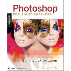
3.       ‘Photoshop For Right-Brainers: The Art of Photomanipulation’ by Al Ward is a very insightful guide for any graphic designer that wants to unleash his imagination and learn how to create special effects and manipulate digital images like a pro. It requires you to be familiar with the basics of Photoshop, but the techniques and tips presented can be used in any version of Photoshop CS. The book presents the fundamental tools and techniques used in photomanipulation and teaches you how to enhance portraits, from the most subtle changes to the most dramatic. It also focuses on a wide variety of effects, ranging from surreal creatures and landscapes, to real world effects, creative advertising and using the human body as your canvas.


4.       ‘Layers: The Complete Guide to Photoshop’s Most Powerful Feature’ by Matt Kloskowski is a book that truly lives up to its title. It contains all the information you need to become a pro at working with Photoshop layers: from the basics, to the most advanced techniques, it covers everything you need to know about this topic. It explains in great detail every aspect about layers, such as using: blending modes, adjustment layers, layer masks, type and shape layers, smart layers and layer styles. It also showcases useful techniques you can use to retouch, enhance photos and mimic photographic effects.


5.       ‘How to Cheat in Photoshop CS5: The Art of Creating Realistic Photomontage’ by Steve Caplin is a thoroughly detailed guide to combining images together to create very realistic results that resemble actual photographs. The book covers many advanced techniques that are useful when creating photomontages, such as: types of selection, transformation and distortion, working with layers, adjusting images, composition, perspective, realistic textures, 3D objects, special effects, shadows/highlights, creating reflections and more.


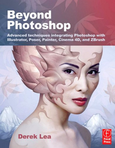
6.       ‘Beyond Photoshop: Advanced techniques integrating Photoshop with Illustrator, Poser, Painter, Cinema 4D and ZBrush’ by Derek Lea is a one of a kind graphic design book that shows you how to use Photoshop in conjunction with five other software packages and how to produce stunning, creative results. Four chapters are dedicated to using Photoshop and Illustrator together, while the others show you how to combine Photoshop work with 3D components generated in Cinema 4D, ZBrush and Poser. It also teaches you how to create a highly detailed digital painting by using Painter and Photoshop. Except for the Illustrator chapters, the book requires you to have a graphic tablet to complete the tutorials and to be an intermediate user of Photoshop.


7.       ‘Art and Design in Photoshop’ by Steve Caplin shows you how to create a variety of graphic design elements that surround us on a daily basis. It starts off by dedicating a whole chapter to typography and another one to the principles of graphic design. Then it fully covers important topics, such as creating: magazine, music albums and book covers, different styles of posters, various types of product packaging, line art, advertising, pixel art, newspaper pages and more. It also delves into other miscellaneous, but very useful effects and teaches you how to mimic the paintings of 15 great artists.

Create a grungy conceptual wallpaper


This tutorial will show you how to create a grungy design based on the concept of ‘music’ by starting off from a simple picture. The effect is achieved using textures, layer adjustments and several Photoshop tools. The same technique can be used to illustrate other concepts in a similar manner.

The tutorial has been created using Photoshop CS5; however, the same effect can be achieved in any CS version without problems.

Step 1.  Start off with a white canvas, over which you can paste this image. The size of the image doesn’t matter; it is up to you to choose if you want this to be in the form of a wallpaper, music album cover etc.


Step 2. Go to Select -> Color Range… and use the following settings:


A selection will appear; click on the Add vector mask button and the selected parts will be masked away.

                Next, pick a white brush and, on the mask layer, go over the parts of the girl’s body that were masked away, until you get something like this:


I’ve also used a black brush on the lower part of the mask to bring back a bit of the red in the original image.


               Step 3. Create a Selective Color… adjustment layer, with the following settings:

You should get something like this:


Step 4. Create a new Curves… adjustment layer, with the following settings:


The resulting effect should be similar to this:


Step 5. Paste the original image again over the other layers and add a Channel Mixer adjustment layer with the following settings:


Then go to Filter -> Artistic -> Rough Pastels… and use the following settings:


The resulting effect should look something like this:


Then, set the layer blending mode to Lighter Color. If you’re using an older version of Photoshop, you can use Lighten instead. The opacity has been left unchanged at 100%.


Step 6.  Paste this colorful texture over the other layers, and set it to black and white by going to Image -> Adjustments -> Black and White… , leaving the settings at default and clicking on OK.

Then, shrink the texture layer and rotate it slightly clockwise, set its blending mode to Darken and lower the Opacity to 6%.


Step 7. In order to illustrate the ‘music’ concept and truly bring this image to life, type many words related to music, in various sizes and fonts, while keeping the color consistent throughout. I’ve chosen words like ‘music’, ‘sound’, ‘radio’, ‘headphones’, ‘tune’, ‘melody’ etc. The color I’ve used is #ff636e. Rotate, skew and arrange them around the girl in the image in a way you find aesthetically pleasing. Feel free to be as creative as you want!

When you’ve covered the area well, select all the text layers, right click and choose Rasterize Type, then right click again and choose Merge Layers. You should obtain a raster layer with all the text on it.

Then, go to Layer -> Layer Styles… -> Gradient Overlay, and use the following settings:


In my case, this is what I’ve obtained:


Step 8. Choose this dirt texture and paste it over your artwork. Depending on the size of the canvas you’ve chosen, you may need to duplicate the texture layer and mask away the excess, in order to fully cover the image.

When you’re done, set the texture to the blending mode Overlay, leaving the opacity at 100%. With a soft brush, mask away the texture on the girl’s face. This final step is what really gives the image a gritty, grungy effect.


The final result:


This tutorial will teach you how to create a design featuring a colorful explosion contrasting with grayscale elements. This design heavily relies on the creative use of brushes, patterns and Photoshop tools/effects.


Though this tutorial was created in Photoshop CS5, you should have no problems achieving the same effect in any CS version.


Step 1. Start off with a blank, nearly square canvas size. In this case, I’ve used 1200x1150.

Create a new layer and save this micro patterns set from ObsidianDawn. To use them, unpack the archive and double-click on the resulting .pat file; this will make them appear in your list of patterns in Photoshop. Then, go to Layer -> Layer Style -> Pattern Overlay… and use the following settings:


Lower the opacity of the layer to 62%. You should now have a grayscale polka dot pattern background:


Step 2. Open this image separately and convert it to grayscale by going to Image -> Adjustment -> Color Mixer… and using the settings below:


Then add on top a Curves… adjustment layer, with the following RGB settings:


Step 3. The next step involves retouching the image, in order to eliminate unsightly noise and make it look smooth and professional. You might have your own method for doing this, which is fine. However, this is my way of doing a very quick retouch: duplicate the image, add a layer mask to the resulting layer and then, making sure you have the second layer selected (not its mask), go to Filter -> Noise -> Median… and type in a small value in the Radius box (in this case, 3).


After that, go to Filter -> Blur -> Gaussian Blur… and input the value 2 in the Radius box.


Fill the mask with solid black and, making sure the mask is selected, pick a 25px round, soft brush and start painting with white on the layer. Only paint over the skin area to give it a smooth effect, while avoiding the lines of the face and body.

To add a final touch, carefully select the lips with the Lasso Tool. Then paint once over them with a bright red brush. The effect might look daft now, but in the final composition, it will be an interesting detail.


Step 4. Next, flatten the image and paste it over the polka dot background. Position it in the center of the image and mask away its white background, until you get something like this:


Step 5. Add two subsequent Curves… adjustment layers, with the following settings:


You should get something similar to this:


Step 6. Save and load this smoke brush set from ObsidianDawn. Create a new layer, pick a smoke brush, the color white, and set the brush size around 200-300px. Paint on the layer by using the brush around the girl’s body in a C shape. You can then mask away the excess using various brushes from the set, to create a more pleasant effect.

Then, go to Layer -> Layer Style and add the following styles to the layer:

Drop Shadow


Inner Shadow


Outer Glow

Satin

After completing this step, the image should look similar to this:

Step 7. Download this sketches brush set, load it and paint two branches on two new layers, as shown below:

Step 8. On a new layer, create two spots with a medium, soft brush, in two different colors. Then set the blending mode to Lighten and duplicate the layer to intensify the effect.
Step 9. Create a new Hue/Saturation adjustment layer with the following settings:

Then, add a layer mask and with a large soft brush, mask away the central part of the image:

Step 10. Pick a light gray, medium and soft brush, and then, on a new layer, subtly paint a little over the parts of the image that appear solid black (around the hair, camera and dress). Next, lower the opacity of this layer, if you find it necessary; I’ve set it to 50%.


Step 11. Create a new layer and paint on it with a smoke brush, or any similar brush you can find, in a similar way to what I’ve done below:


Then, go to Filter -> Blur -> Motion Blur… and use the following settings:


Step 12. Create a new layer, choose a swirl brush from the sketches brush set and use it as below:


Next, go to Filter -> Blur -> Gaussian Blur… and input a value of 25:


Step 13. To create the stunning colorful explosion that truly makes this tutorial unique, on a new layer, paint again with a sketch brush of your choice as illustrated below:


Then, go to Filter -> Noise -> Median… and input a value of 5. After that, go to Filter -> Blur -> Gaussian Blur… and input a value of 15.

With a large soft brush, erase or mask away a lot of the resulting effect, until you end up with something like this:


Step 14. Duplicate the colorful explosion layer, turn it upside down and place it lower than the first one. Then, change its saturation to a yellowish hue, to obtain a similar effect to this:


Step 15. Create a new layer and use the flower brush from the sketches brush set, as shown below:


Go to Filter -> Noise -> Median… and input a value of 11. After that, go to Filter -> Blur -> Gaussian Blur… and input a value of 8.

After that, mask away most of this layer, leaving only the tips of the petals on the sides:


Step 16. Because the image is rather dull the way it is now, add a new Curves… adjustment layer:


Step 17. I’ve added the word ‘photography’ to match the theme of the design. The font is Windsong, size: 216, character spacing: -50. To achieve the text effect below I’ve simply overlaid two text layers of different colors.


Step 18. Create a new Levels… adjustment layer to brighten up the image a bit more:


Step 19. To add a stylish border, merge all the layers together and go to Image -> Canvas Size… and use the following settings:


Then go to to Image -> Canvas Size… again and use these settings:


The final result:

top